Moving Like Native Apps on the Web: Complete View Transition Guide
Ever visited a website and thought, "Wow, this feels like a native app"? The secret behind 80% of that feeling is page transition effects. Today, let's dive deep into SSGOI's various View Transitions with live demos!
Why View Transitions Matter
When we use smartphone apps, screen transitions happen naturally. Opening a chat in KakaoTalk, zooming photos on Instagram - these smooth transitions make apps feel "premium."
What about the web? Most of the time, pages just snap! - they change instantly. Like switching TV channels. This experience constantly reminds users "Oh, I'm using a website."
SSGOI's View Transitions eliminate this gap. You can implement native app-like natural screen transitions on the web!
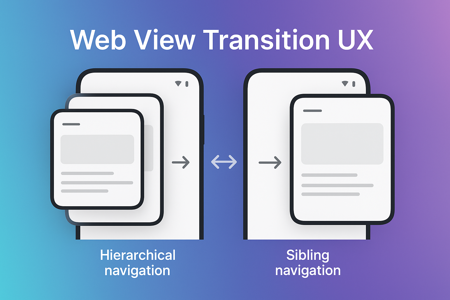
The 3 Paradigms of View Transitions
Screen transitions aren't just about "making things pretty." They're crucial UX elements that visually communicate where users are navigating. SSGOI categorizes them into 3 main patterns based on navigation types:
1. 🌅 Top-Level Navigation: Fade Transition
"Going somewhere completely different"
From home to settings, from shopping to profile... For navigation between unrelated pages, Fade transition works perfectly. The screen smoothly disappears and reappears, naturally conveying that the context has completely changed.
Loading demo...
Fade is the most basic yet powerful transition. Not too flashy, yet much smoother than static page changes. It feels especially seamless in dark mode.
2. 🏗️ Hierarchical Navigation: Drill & Hero Transitions
"Going deeper or zooming in"
Drill: Navigate Like Folders
When exploring hierarchical structures like Settings → Notifications or Category → Subcategory, Drill transition is perfect. Think of iOS Settings app - that feeling of new screens sliding in from the right!
Loading demo...
The key here is directionality. Entering from the right, exiting to the left. Users naturally understand "Oh, I've gone deeper into a level."
Hero: Small Things Growing Big
From product list to detail page, from gallery to fullscreen... When you want to give the feeling of the same object expanding, use Hero transition!
Loading demo...
Images or cards naturally expanding into detail views - doesn't it feel just like a native app? Services like Pinterest and Medium make great use of this pattern.
Pinterest: Cards Unfolding Specially
A variant of Hero where cards expand in place to fill the entire screen. Inspired by the Pinterest app.
Loading demo...
Unlike regular Hero, cards expand in place, making it especially effective in grid layouts. Users clearly perceive which item they selected.
3. 📖 Sibling Navigation: Scroll Transition
"Turning to the next page"
Between blog posts, onboarding steps, gallery images... When sequentially exploring content at the same level, Scroll transition feels natural.
Loading demo...
In web environments familiar with vertical scrolling, this transition provides "natural continuity." It feels like scrolling through a long page. Particularly powerful for storytelling or tutorials.
Practical Tips
1. Consistency is Key
Maintain the same patterns throughout your app. Always Drill for hierarchical navigation, always Scroll for sibling navigation... This consistency provides users with "learnable patterns."
2. Control Speed with Spring Physics
SSGOI uses physics-based spring animations. Fade transitions feel more natural when OUT animations are faster than IN:
// Faster OUT, smoother IN
fade({
  outSpring: {
    stiffness: 400,  // Quick disappear
    damping: 30
  },
  inSpring: {
    stiffness: 200,  // Smooth appear
    damping: 25
  }
})

// When you need fast transitions
fade({
  spring: {
    stiffness: 350,
    damping: 30
  }
})

// Elegant slow transitions
fade({
  spring: {
    stiffness: 150,
    damping: 25
  }
})
3. Consider Mobile Optimization
On mobile, you might want different transitions or disable them entirely for performance or UX:
// Use different transitions on mobile
const config = {
  defaultTransition: isMobile ? slide() : fade(),
  // Slide might feel more natural on mobile
};

// Disable animations on low-end devices
const config = {
  defaultTransition: isLowEndDevice ? null : fade(),
  // null disables transitions for instant changes
};

// Adjust based on user preferences
const config = {
  defaultTransition: userPrefersReducedMotion ? null : fade({
    spring: { stiffness: 300, damping: 28 }
  })
};
4. Don't Forget Performance
Even fancy transitions are counterproductive if they stutter! SSGOI automatically handles GPU acceleration and will-change optimization, but be careful with heavy images or complex layouts.
Browser Compatibility?
No worries! Unlike Chrome's View Transitions API, SSGOI works in all modern browsers:
- ✅ Chrome/Edge
- ✅ Firefox
- ✅ Safari
- ✅ Mobile browsers
What about IE? Well... is anyone still worrying about IE in 2024? 😅
Wrapping Up
View Transitions aren't just "pretty effects." They're powerful tools for visualizing users' mental models.
Where you came from, where you're going, where you are now... Naturally conveying all this information - that's the essence of good View Transitions.
With SSGOI, you can easily implement all of this. How about making your website feel like a native app?
Get Started Now
# React project
npm install @ssgoi/react

# Vue project
npm install @ssgoi/vue

# Svelte project
npm install @ssgoi/svelte
Check out the official documentation for detailed usage. See you on GitHub if you have questions!
P.S. The transitions in this blog post were also made with SSGOI. Try navigating to other posts! 😉